
Ketika membangun website yang optimal untuk pengguna mobile, dua pendekatan desain yang sering dibahas adalah website responsif dan mobile version (versi mobile terpisah). Memahami perbedaan keduanya sangat penting agar Anda dapat memilih solusi terbaik untuk bisnis Anda. Berikut penjelasannya beserta rekomendasi dari jasa buat website profesional.
Website responsif adalah desain yang secara otomatis menyesuaikan tampilan dan layout sesuai dengan ukuran layar perangkat yang digunakan, baik desktop, tablet, maupun smartphone. Ini artinya, satu URL dan satu versi website digunakan untuk semua perangkat, tapi tampilannya akan fleksibel dan mudah diakses. Keuntungan utama dari website responsif adalah kemudahan pengelolaan, konsistensi pengalaman pengguna, dan dukungan SEO yang lebih baik. Banyak jasa buat website kini mengedepankan solusi responsif karena lebih efisien dan user-friendly.
Sementara itu, mobile version adalah website terpisah yang khusus dibuat untuk perangkat mobile. Biasanya memiliki URL berbeda (misalnya m.domain.com) dan desain yang disederhanakan agar cocok untuk layar kecil. Meskipun mobile version dapat dioptimalkan secara spesifik untuk pengguna smartphone, pendekatan ini membutuhkan pengelolaan dua versi website sekaligus, yang bisa menyulitkan dalam pemeliharaan dan memperbesar risiko kesalahan teknis.
Dari segi SEO, website responsif lebih unggul karena menggunakan satu URL yang konsisten untuk semua perangkat, sehingga memudahkan Google dalam pengindeksan dan meningkatkan peringkat pencarian. Mobile version, di sisi lain, harus memastikan pengalihan URL dan sinkronisasi konten agar tidak menimbulkan duplikasi yang merugikan SEO. Jasa buat website yang profesional selalu menyarankan solusi responsif untuk hasil SEO yang optimal.
Dari sudut pandang pengguna, website responsif memberikan pengalaman yang lebih mulus dan konsisten tanpa harus berpindah URL atau menunggu halaman terpisah dimuat. Pengguna dapat mengakses fitur dan konten lengkap dengan navigasi yang sama di semua perangkat. Dengan menggunakan jasa buat website, Anda dapat memastikan desain responsif yang modern dan intuitif.
Namun, ada situasi tertentu di mana mobile version masih dipilih, terutama jika website membutuhkan fitur yang sangat berbeda untuk perangkat mobile. Tetapi untuk kebanyakan bisnis, website responsif adalah pilihan yang lebih praktis dan efisien.
Jika Anda ingin memiliki website yang mudah diakses, SEO-friendly, dan memberikan pengalaman pengguna terbaik, segera konsultasikan kebutuhan Anda dengan jasa buat website terpercaya. Dapatkan solusi desain responsif yang tepat untuk mengembangkan bisnis Anda secara digital!


 Industrial Robotics Integration
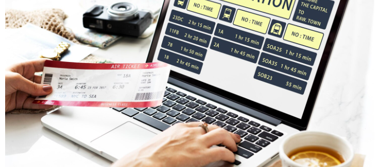
 IT Outsourcing Service
 Secure Internet SD-WAN Connection
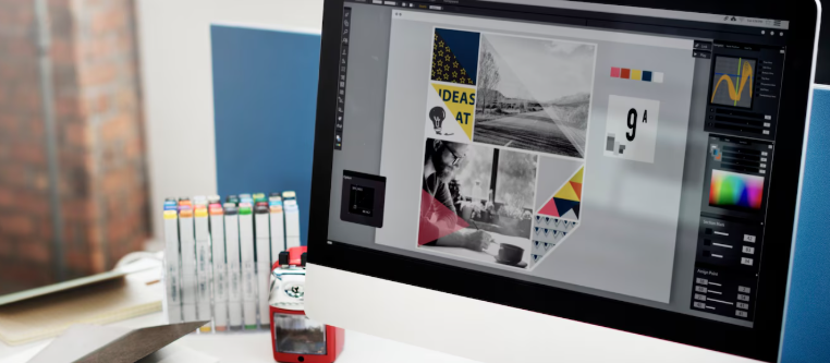
 Digital Marketing Service